I decided to change the format of my CV, making it more of a leaflet, that I could package in a sleeve that would feature my visual identity in order to ensure everything tied together.
I decided to feature a timeline on the reverse side which would document work experience, exam results and jobs chronologically. I planned to make the other side a bit more personal, perhaps with a personal mission statement and personal/contact details.


The typeface I have chosen to accompany my visual identity is Bebas Neue Light, as in my opinion, a simple but not submissive structure is needed to accompany the design. I feel that this typeface draws attention to itself but it doesn't demand all the attention of a viewer.

I used the same infographic symbols in my CV that I had used before as they allow me to say things about myself without clogging up the page with too much text. It allowed me to give the timeline part of the CV more structure and guidelines to follow:
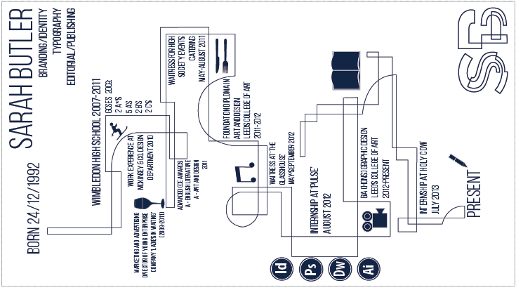
I found I was easily able to slot the symbols into the structure of the timeline, which made them more incorporated with the design.
In order to make this slightly more personal, I chose to include some photographs I have taken over the past year with a very low opacity, so they could be seen as a background. I tried to chose a variety and used photos that I had loved so as to give the reader a better idea of me.


No comments:
Post a Comment