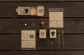
Monday 27 May 2013

OUGD402 Evaluation

1.  What skills have you developed through this module and how effectively do you think you have applied them?

I have developed skills in recognising different aspects of both my own design and other peoples. As a result of gaining knowledge based on these areas I have been able to give and receive more informed criticism, which has really helped my work in the crits, and allowed me to have a lot more focus when it comes to my own design.

2. What approaches to/methods of design production have you developed and how have they informed your design development process?

I have altered the way in which I approach design in terms of time, and now know what part of the design process I need to spend more time on in order to produce an effective end product. I have learnt to get up early and work in the morning as it seems that this way I get plenty more donw without feeling like I've spent a whole day working.

3. What strengths can you identify in your work and how have/will you capitalise on these?

I have identified strengths in illustrative practice, something I haven't felt I've been able to do all year and plan on incorporating this into digital design, and merge the two together somehow, to create more mixed media designs.
After all of self-reflection exercises we have done this year, I have also come to feel much more comfortable in the analysis of my own work, being able to pick up on what needs improvement. This has helped me greatly in crits as I feel I have more understanding of the feedback I am receiving.

4. What weaknesses can you identify in your work and how will you address these in the future?

I can identify some weaknesses in covering all aspects of the possibilities of a brief before settling down on an idea, often meaning I settle for something early, and find later that there is plenty more I could have done with it. I plan on changing this by allotting time to design research and brainstorming and not allowing myself to finish earlier than that allotted time.
I have also identified a weakness in breaking out of my comfort zone, something I have been reluctant with all year, preventing me from experimenting. Over the summer I plan to experiment with print and letterpress in my time so that I don't feel I have something at stake when I do it.

5. Identify five things that you will do differently next time and what do you expect to gain from doing these?

1) Spend more time looking at design blogs, in a more casual manner, making design more of a part of my life than part of my degree.

2) Spend more time in the library - the internet is repetitive, unreliable and sometimes too current.

3) EXPERIMENT - screen printing, letterpress, embossing. Use this to help break out of my comfort zone in second year by using alternate production methods.

4) BLOG everything and keep up to date with it - blog immediately after sessions so the information is still fresh.

5) Look into applying for placements over the course of the summer and next year - don't be hesitant in contacting designers.


6.How would you grade yourself on the following areas:
(please indicate using an ‘x’) 

5= excellent, 4 = very good, 3 = good, 2 = average, 1 = poor

1
2
3
4
5
Attendance


x


Punctuality


 x


Motivation


 x


Commitment


 x

Quantity of work produced


x


Quality of work produced


x

Contribution to the group


x


The evaluation of your work is an important part of the assessment criteria and represents a percentage of the overall grade. It is essential that you give yourself enough time to complete your written evaluation fully and with appropriate depth and level of self-reflection. If you have any questions relating to the self evaluation process speak to a member of staff as soon as possible.


Thursday 23 May 2013

It's Up To You Evaluation


There are some elements of my promo pack which I am happy with and proud of, but other parts that I am not. While I quite like the varied themes within the promo pack, flickering between illustrative and infographic may not have benefited the end product as much as possible. I think the contents would show more partnership and consistency with each other if the whole pack followed a slightly stricter theme.
Of all things, I am least happy with the business cards. I feel as though I rushed it a lot to get them printed and finished, and although I did have the time, I perhaps didn't allocate it appropriately

Tuesday 21 May 2013

It's Up To You - Packaging

I found that after finishing most of the aspects of my promo pack that it wasn't as innovative or out of the box as I would have liked it to be, so I decided to embody this in the packaging.


This whole concept is very personal but the mailer style packaging is clean and white which sort of takes away from the very personable content.


This packaging feels sort of natural and organic in the materials used. Combined with the colour scheme it gives it quite an earthy exterior.


The concept of this self promotion pack is kept extremely consistent and gives off a top secret impression, until it is opened where it looks lore like a gift basket.


This idea of packaging could become very recognisable for this person, and it prompts the viewer to make the product given to them (with supplies to make it). This ensures that it engages the viewer entirely.


This one is a little more simple but still equally as effective. The tissue paper in accordance with the colour scheme appears very elegant, similarly as with the consistency of the logo stickers.


This designer avoids any chance of the viewer forgetting who he is, embellishing 'Gary Corr' all over the products inside. The printed tissue paper is a nice touch and luckily the sweet provided works perfectly with the colour scheme.


I love this concept of treating the packaging like postage. It builds a slight suspense and curiosity when opening it because it just seems like a package, but a package the employer can't remember ordering.

I decided to do something similar to this postage packaging concept but wanted it to be slightly more personable. After some research I landed on the idea of using a mailing tube but incorporating my own design on the exterior to keep it consistent with the rest of my promo pack.


I tried a couple of the ideas I had generated, each with quite a different approach but both consistent with the rest of the promo pack.

The first was based on a doodle like drawing I had done which I had then scanned in to work from. When it was scanned in I found it was of a poorer quality so I outlined it on illustrator.
Some parts of the image:


While I liked this design, I felt I wanted to keep it more like the other parts of the pack, including the symbols I had designed with a simple label of 'Sarah Butler/ Graphic Designer', and found that this one worked much better in partnership with the other parts of the promo pack.


This design will be mounted around the tube.

The last element of my promo pack is a little more difficult to explain in terms of design process.
The idea for my poster (which I hadn't planned on including) came because I started to doodle with my logo on a spare bit of printer paper and found that some elements of the doodle worked really well, so I redesigned some parts of it on a larger scale.


I added just a little colour, similar to those used in the promo pack which gave it a place with them. It varied hugely from the other parts in terms of style, but instead of looking out of place, seemed more to exhibit versatility.