To create an information/promotional pack about myself, I had in my mind that I wanted to create a series of documents/business cards/posters etc that 1) exhibited where my skills lie within graphic design, 2) harmonises a variation of chosen approaches and 3) shows how I have progressed over the year.


This selection shows some pretty varied styles working in harmony, as I wanted mine. I had concerns about showing different design approaches as they may end up looking quite random and thrown together, so to keep them consistent with each other, variables like colour scheme and stock may have to be kept the same.


This mailshot seems very personal, with the script type on the designers hand it acts as though the words fit into the designers hand.


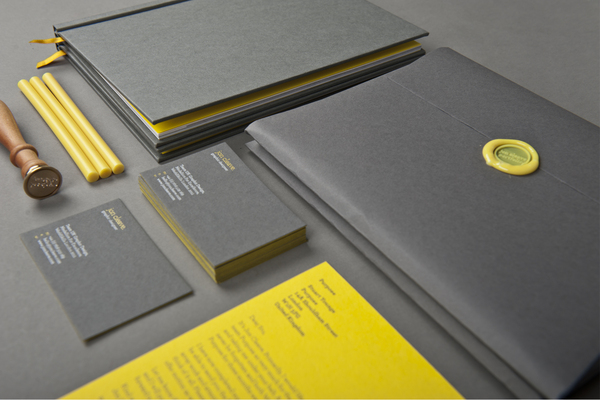
I love the stock used for this, it makes the whole pack quite demanding and keeps it consistent throughout.


This design is simple and easy to follow but in it's simplicity it may appear a bit dull next to some of the other self promotion designs I found.


This designer has gone to great lengths to make every aspect of this design personal and the simplicity of some aspects of it is evened by these personal touches.


These designs are varied but consistent and the infographic nature makes it quite unique and makes, at least the CV, very readable and followable.


The design on this pack is a little more interesting as the pattern that makes up some parts of it is created with the existing logo for the designer, which, again makes this totally unique.


This colour scheme is simple but quite subtly demanding perhaps as it is teamed with bold blocks of blue instead of a more delicate infusion of colour.


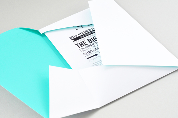
A hugely innovative design for a job application, this package design draws people in because it is packaged in such an intriguing way. Although information on it is limited due to the nature of the production, it really entices people to check out the designers website and take the rest of the application from there.


This pack is a bit softer, not as demanding of attention as some of the others, which in some contexts may or may not be wise as it could be deemed forgettable or dull.


These business cards are memorable and probably something someone who received it would hold onto. While the nature of it limits the amount of information that can go on it, the idea speaks for itself and allows for only the vital contact details.
After identifying what aspects I would need to be consistent in my pack I though about what I wanted to include.
I wanted to avoid doing a booklet as I had done a lot of them in other recent briefs and so decided to show information about the way I design in a mind map based poster, finding a way to incorporate info graphic or semiotic elements as that is something I have learnt to effectively produce this year.
However, I chose to design a hand rendered poster, as it was ultimately drawing that made me want to go into the Graphic Design field, and it is something I haven't been able to do much of this year as I was trying to perfect software skills as I felt behind in that area. along with this I wanted to do some simple business card and some form of packaging.
No comments:
Post a Comment