Wednesday 30 April 2014

OUGD502 A Design Presence - Website

I mocked up some initial scamps so I could cement a consistent layout and format to each page before I started designing. This would keep the same design as all other elements to the brief so I wanted to ensure it would translate as well on screen as off.


I concluded that putting the logo at the top of the webpage gave me more allowance to alternate the design in the content part of the page. I selected a few of the designs that I thought would work well for each page (Projects, About, Services and Contact).

I chose on the Projects page to use the layout that gave me the biggest scope to showcase a lot of work on page, and so I was able to show snapshots of each project, giving the viewer the opportunity to look at all or a few of them.


I used the same typeface as on my branding and promo pack to keep things simple. I wanted to create a rollover image that would provide a title or small amount of information about each project to give an explanation before it was opened:


While I wanted to ensure that the website looked simple, I found that this design was a bit boring and would become quite same-ish. I experimented with using more visuals to break up the white space on the page:


I tried out some changed with the colour, and while I liked the black header it seemed then to go in the opposite direction and became a bit much.
I decided to keep the first version I tried. However, I found at this point that I had now left it too late to find the time to code the website properly, and so had to just create the proposals:


Saturday 26 April 2014

OUGD502 Life's A Pitch Presentation

Above is the presentation that our group 'Seam' delivered to the group. We planned for each person to provide the information on whichever area we had been assigned to research, as this person knew the most about that subject. We all wore black and white so as to be consistent with the branding of our company. and as a whole the presentation went smoothly

Thursday 24 April 2014

OUGD502 A Design Presence - CV

I decided to change the format of my CV, making it more of a leaflet, that I could package in a sleeve that would feature my visual identity in order to ensure everything tied together.
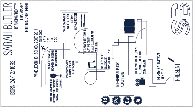
I decided to feature a timeline on the reverse side which would document work experience, exam results and jobs chronologically. I planned to make the other side a bit more personal, perhaps with a personal mission statement and personal/contact details.


The typeface I have chosen to accompany my visual identity is Bebas Neue Light, as in my opinion, a simple but not submissive structure is needed to accompany the design. I feel that this typeface draws attention to itself but it doesn't demand all the attention of a viewer.


I used the same infographic symbols in my CV that I had used before as they allow me to say things about myself without clogging up the page with too much text. It allowed me to give the timeline part of the CV more structure and guidelines to follow:


I found I was easily able to slot the symbols into the structure of the timeline, which made them more incorporated with the design.

In order to make this slightly more personal, I chose to include some photographs I have taken over the past year with a very low opacity, so they could be seen as a background. I tried to chose a variety and used photos that I had loved so as to give the reader a better idea of me.