Choose 5 criteria from the list below that will guide your selection of work
- Creative use of Type
- Visual Quality
- Tone of Voice
- Attention to detail
- Simplicity of Design
- Meaning or Message
- Audience engagement / interaction
- Style or aesthetic quality
- Use of Media & Method of Production
- Relationship between Form & Format
- Interest in the content.
- Use / Choice of language
- Structure & Layout
1. Creative use of Type

Morgan Freeman by Straye-Close
The letters are so compact they're barely noticeable but the entirety of the portrait is made up of them.
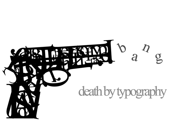
Simplistic and witty, the make up of the gun is extremely clever.
This design is basic but fitting, obvious and very recognisable.

A Si Scott design, well executed in keeping the shirt solid, gives an impression of depth in the wearer.

Simple and elegant, this design is innovative and looks as though it could prove very versatile
2. Attention to detail.

The off-symmetry in this design exaggerates the detail in each angle and the overall structure.

Ordinarily not my cup of tea but the attention to detail in this Linn Olofsdotter collage is undeniable, especially given the complete structural variation between the design on the right side and the left.

Fantastic Mr Fox, one of my favourite films, exquisitely exhibits the finest detail I have seen in any stop motion animation. The slightest breeze showing each different hair move is hypnotizing and beautiful.


Another HelloVon piece but i can't help myself. The combination of digital and traditional techniques of illustrating makes for this finely detailed design.
3. Simplicity of design

This design pretty much speaks for itself, the structure and idea is shown visually as the word itself.

Basic colour scheme and and the footprints give the impression of the scale this is meant to represent.

Despite the simplicity of this, the content isn't immediately obvious. It was designed to portray the varying laters of creativity.

Although this 'Quit Smoking' ad seems quite twisted it is undoubtable effective in it's simplicity, and in my opinion more effective than those that use images.

A basic design for The Antlers 'Burst Apart' album cover art but completely fitting to the name, and the colour scheme seems to carry it all.
4. Style or Aesthetic Quality

The simplicity of this Waitrose Infused Olive Oil design adds to the product itself. The colour of the oil is exaggerated by each image and vice versa, contributing a sense of purity.

The colours used in the packaging of these kitchen utensils are what makes the product, they are all so vibrant and varied. Essentially, when shopping in a supermarket, people's eye is drawn to colour.

This design has the kind of aesthetic that would excite the public, the colours and their association with Summer and warm weather allows people to look forward to the Summer.

The design of this Samurai vodka bottle is individual and effective, particularly in the consistency of it's simple design, following from the case to the bottle.

Another example of Waitrose products, the varying size and colour of the fonts used are interesting in the way that they have ordered the importance of what is on the packaging.
5. Structure and Layout

The basic layout of this design, the colour scheme and simple lowercase type combined with the subtle play of words makes this a slightly child-like and very endearing design.


Simple in choice of type colour scheme and layout, until the purpose of the red 'o's becomes apparent. It manages to pull off straightforward and clever, making it quite charming.

Designed as a tutorial to successfully line up text on Adobe InDesign. The title and repetitive layout is quite intimidating but the structure is so simple and beautiful that it seems to take away from that.
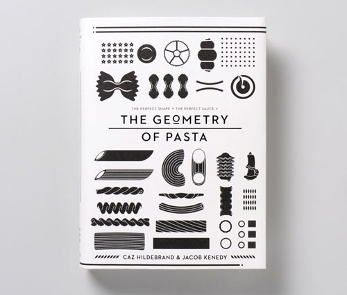

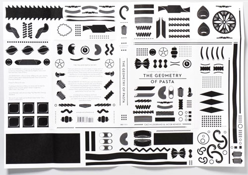
I love everything about this cookbook, from the monochrome design of the pasta to the simplicity of the layout to the instruction-like structure of the book, I look at it and almost feel like I'm being expected to build a model of a plane.


A Here Design for Gail's Bakery, simple and beautiful. The design on the cups manages to look structural and mechanical while maintaining an elegant quality.
No comments:
Post a Comment