
In my opinion, this design is taking 'less is more' a bit far. The lack of detail is not inspiring and i was under the impression that their brief was to excite, encourage and inspire.

I got a bit more hopeful in the idea of an alternative animated design, but to me this is just quite creepy.
Below are two examples od design that I love:

I can pretty much see no wrong in anything Carson does, ironically since he seems to stumble over some of his ideas by accident. Ordinarily, if it were anyone else, I have little interest in designs like his, but his style can be applied to a huge range of products.
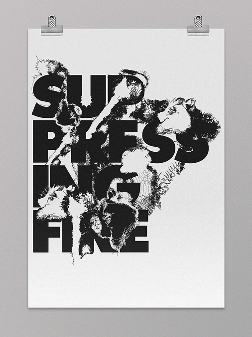
These Michael Kosmicki designs epitomise the style I am interested in, styles that portray simplicity but aren't actually that simple. Both in monochrome, colours wouldn't lend themselves to these images, I don't feel like they need colours to be vibrant.
No comments:
Post a Comment