When we started looking at the purposes of Graphic Design we found that they could be split into several categories:
- Information and Way-Finding
- Editorial and Publishing
- Product and Packaging
- Branding and Identity
- Retail and Promotion
Information and Way-Finding
Information and way-finding design is about efficiency. It identifies routes from one thing to another that are most beneficial and works to aid the person using it, to be perhaps more helpful to the person using the design.
http://www.designcouncil.org.uk/about-design/Types-of-design/Graphic-design/Information-design/
http://applied-espi.com/
http://www.dennishambeukers.com/?tag=wayfinding
http://www.richardwolfstrome.com/
http://www.ai.mit.edu/projects/infoarch/publications/mfoltz-thesis/node8.html
http://wayfindinguk.wordpress.com/
Examples
This map leaflet of the Tate Modern is consistent and in-keeping with the way-finding design all over the building, the clear, large gothic fonts and the use of both type, and image in the form of a code to guide people through the museum.
These technique of way-finding at the Tate Modern is so basic but fits the needs of everyone, but including type, image and arrows all in one sign. The signs on the glass walls of other areas are subtle but not unnoticeable.
The use of signage at Leeds Gallery is consistent and simple, telling you all about what is inside before you even get in as the design is clear and legible from a distance.
These information points can be seen scattered over many tourist spots, the Albert Dock being only one of these. They show anything that a tourst might be required to know and many of these are interactive, so there is a whole breadth of information accessible at one point.
These maps of London are like hugely simplified versions of regular maps, showing where the viewer is and colour coding parts. It shows the route in the direction your standing it so as to help people who struggle with map reading or with a bad sense of direction.
This bus map of Dublin is designed in the same way as the London Underground maps and other subway systems all around the world. The colours are what distinguish the routes, and these maps can be found all over the city to prevent people from getting properly lost.
This gallery keeps the layout consistent, with a particular typeface and colour that helps people recognise where they will find directions or a guide. The type is large and bold purely to help people get around from a distance.
This map for the National Gallery is basic and minimal. The colour coding makes it easy to navigate and they are made more bold and distinctive by the white background.
These icons are all simple and recognisable to everyone, allowing people in tourist spots such as these to not need to translate words to find their way around. The arrows make directions clear and concise and are frequent throughout these buildings.
Much like other maps for tourist sites, this one uses universal icons so that readers can recognise their route easily. It includes a key for those who don't know an icon, and it keeps the whole thing simple, making the priority getting from A to B.
Editorial and Publishing
Editorial and publishing design can differ greatly, In some respects, for example, magazine editing, the design is required to be quite eye-catching and exciting as in a lot of cases several magazines will be publishing the same story. However much of the time the design needs to be quite easy on the eyes for reading purposes, a lot of though must be put into the colour and type used.
http://fuel-design.com/
http://www.designcouncil.org.uk/about-design/types-of-design/graphic-design/editorial-design/
http://creattica.com/editorial/
http://www.aroundeuropeonline.com/
http://www.coroflot.com/sanctvs/Layout-and-Design
Examples
This layout is simple and thus is able to control what is the most important element of the article and when. The first page merges the type and image, to show why are they linked while this allows the second page to separate them completely but not seem random.
These are articles from the inside of Bloomberg Businessweek and show that with topics that are even just mildly differing, the layout of the articles can be vastly different. The first article on Lehmen Brothers Bank is aimed at the sort of person who is interested; bankers; businessmen etc.. With only one image the focus on the text, and particularly the sarcasm of the heading. Meanwhile the Apple article shows much of what it is about by using the image.
The whole composition and layout of this page is in aid of something sport related and that is all made obvious in it's obvious depiction of speed and the idea of winning. The break in the text shows the speed at which the runner was moving, along with the blurred background. This also allows for more emphasis to be put on the words and what is being said.
These magazine pages have an overload of shapes, and even the photograph stays very angular, and each page is consistent with the other two in colour and layout. In specialist magazines it is important to have an identifiable style over more general magazines.
This was a design for Sainsbury's own line of food that was never used. The colours are in-keeping with the existing brand and seem fresh and natural, and the simplicity could have represented the food well.
This is a collection of pages from Catwalk magazine and it shows huge variation in the layout and design of the pages, mostly based on the tone of the article. Some more editorial spreads have very little type whereas the informative pages either have all type and no image of a fairly even balance of both.
These page spreads from a car entusiasts magazine is very dramatic. The varied sizes of the fonts allow the emphasis to vary from word to word, perhaps helping the reader understand what the important parts of each spread is.
This collection of two page spreads all bare one thing in common; a simple but very interesting layout. The alignment of the type combined with the positioning of the image is effective individually to each spread in a different way, presumably to aid the content of the article. It lays out what the topic is before reading anything.
The colours used for this cookbook are neutral and simple, much like the meals that are shown inside it. The idea is to keep things easy for inexperienced cookers, and the combination of the images, type and colours make it all readable and easy to follow.
Product and Packaging
Product and packaging design is much more commercial. The design is based on the aesthetic and how a potential buyer will respond to the exterior of the product. This is achieved through the layout, use of colour and the information given on the packaging.
http://www.packagingoftheworld.com/
http://www.thedieline.com/
http://www.smashingmagazine.com/2008/06/02/beautiful-and-expressive-packaging-design/
http://www.designcouncil.org.uk/about-design/types-of-design/packaging-design/
http://www.1stwebdesigner.com/inspiration/japanese-product-packaging-design/
Examples
This Coca Cola ad isn't how the bottles are packages in stores, but the designers kept all the key colours and variations of the product in this advertisement. The cocoon used as a case for a bottle is simple and elegant it it's construction and brings the whole ad together by injecting one vibrant colour.
While the design on these hair product bottles and pot are simple, the colours and layout are kept consistent, only varying in size for the much smaller pot. Similarly the shapes are random and look moulded, in a way that someone may want their hair to me easily mouldable.
This 'Honey Whisky' could be guessed just from the cap, which looks like a bees nest in texture and incorporates melting wax which could be likened to honey in its consistency and colour.
This packaging for a cosmetic soup brand is delicate in it's illustrations and when the bottle is places in the habitat of it's box, the illustration merges with another to create an image, making the packaging just as interesting as the product itself.
The design on this bottle is much more simple than it seems as it is just a basic lined background, giving off the impression that is it magnified which is a result of the alcohol inside. This technique allows the letters to stand out as they're not changing.
The stoney exterior of these soap dispensers make it seem very natural. Whether or not it is, the user wouldn't know since this is all they see, and it seems healthy and clean simply in the colour and texture.
This pot of Earl Grey teabags was a mock up by a student and the stripped down element is very effective. Earl Grey is already one of the most popular brands of tea in the world and the idea behind this design is that it doesn't need selling, it's 'just tea'.
Normally the Grey Goose vodka bottles have delicate semi transparent silhouettes which make it seem quite refreshing, but I love this adapted limited edition version, making the bottle look like a sports water bottle. The bold gothic fonts step away from the delicacy of the type used for the regular bottle.
This packaging for laundry detergent is simple and the fine delicacy of the illustrations shows that is was drawn very carefully, as carefully as someone would like their clothes to be washed. The simple neutral colours are very calming and give off some sort of subconscious imaginary fragrance when combined with the illustrations.
The vibrancy of this packaging is ideal for what it's holding, the background give off a jungle or rainforest impression and combined with the colour scheme makes the whole thing very exotic and zesty feel.
Branding and Identity
Branding and identity design must be based on the image of the brand as this design, particularly of the logo, becomes their identifier to the rest of the world. Often the logo and product (if there is any) will bare the same qualities that presumably the brand want to become recognisable.
http://justcreative.com/2010/04/06/branding-identity-logo-design-explained/
http://www.spydesign.co.uk/
http://inspirationfeed.com/inspiration/35-perfect-examples-of-branding-design/
http://www.feeldesain.com/125-branding-design-inspiration.html
http://www.brandingidentitydesign.com/
Examples
This brand does keep the logo on everything but it is kept on those things that require it i.e., business cards, envelopes etc.. It was said in their brand strategy that they planned on keeping things minimal, only "designing what is necessary".
This 'kosan gas' brand keeps things simple but still memorable. The vast quantity of merchandise alone allows each and every part of it to have it's own slight variation of the same logo and slogans without it venturing far away enough to become an anomaly.
This brand manage to create a lot of varied ideas for advertising considering they are only using one colour. The designs vary in their dynamics, since the logo is kept simple but the websites and screen shot are very busy. In spit of this they're still linked to each other and obviously part of the same brand.
These designs for La Boheme restaurant are consistent and likeable. The script font is child-like and endearing in the way they wrap around the simple food related drawings, and since it was designed for this campaign there isn't a fear of competing with other brands with the same type. The colours and use of wood keep the whole brand rustique and original.
The collection of the brand merchandise for this company has a traditional and vintage style, probably in aid of their target audience. The shape and whole layout of the logo is simple but not expected and the grainy quality of the stamps is in-keeping with the vintage aspect.
This charity campaign is extremely consistent in their advertisement posters, keeping things simple with only one colour and a plain white image. The slogans, which make giving to charity seem such a basic everyday thing, like 'flipping an egg', are very relatable for customers.
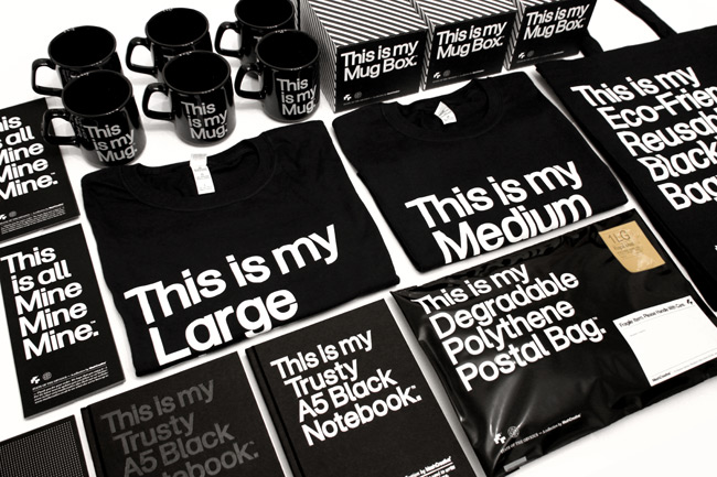
While the type and alignment used for this brand is very common, the slogan allows it to stand out. The 'This is my' part of each product is easy to manipulate and translate and thus has the potential to become the recognisable identity of this brand all over the world.
Each of these packets of food all link together in the illustrations used on the front, showing a progressive story of how the food is prepared, from the farming to the cooking. The simple two tone illustrations combined with the pastel colours makes the packaging very identifiable.
This design has a vintage feel to it, the watercolour looking paper and dark red typeface keep it simple and old fashioned. Such minor details as the clasp print on the envelope and the stringed tag make the whole design unique.
This design is very simple which allows it to maintain a consistency, with the use of only one colour and a simple lowercase type. The colour is bright and could easily become recognisable of this brand.
Retail and Promotion
Retail and promotion design bare similar properties to product and packaging design in that they both need to be an effective and appealing visual representation of a product. Retail and promotion is heavily affected by the target audience as sales and layout will be required to fit the needs of the audience.
http://retaildesignblog.net/
http://igniteretail.com/
http://www.design4retail.co.uk/
http://www.rawls.co.uk/
http://www.haringwoods.com/#/retail-promotion/4560178805
Examples
This Roberto Cavalli store in Milan was redesigned entirely to show the concept behind the new brand. This allows viewers to see the designs in the context in which they were intended.
This Chanel window in Harrods rotated solely around one perfume and pays such attention to the aesthetic of the bottle. The windows are cut in the shape of the bottle and the interior is like a glass case filled with liquid. The reflections allow the bottle to give off all the colour that fills it.
This Italian coffee shop rotates around the idea of the coffee machine. It has machines from different eras and it's the handcrafted and homely detail of the store that gets it it's business, some aspects of which would attract any coffee-lover.
This eyewear store in Beirut had this window designed for their 'Eyewear Wonderland' line. Everything was constructed from dyed fabrics and the delicacy of the outcome and vibrancy in the colours are all in aid of the 'Wonderland' idea.
These designs for the Harrods windows in the run up to Christmas are directed mostly at women. Although it is only the shoes and dresses that are on sale inside, since they were fairytale inspired, all the minute details included are what viewers remember about these fairytales. The more minor characters or the enemies are what define the stories and all the add-ons have been executed perfectly.
This Christmas decoration used in a store window of a glasses shop on the Kings Road in Chelsea is unusual and not traditionally Christmassy. However, upon a closer look it seems that neither are the glasses they're selling in the window, all red and black like the decorations, but when combined with the ribbon and glitter balls, it does bring it back to Christmas.
This Nike store design isn't immediately obvious until viewers learn that the screens do have moving images, shown in the image of Serena Williams. The colours and non photographic images used are reminiscent of speed, ideal as this design was debuted at the same time as a new line of sports footwear.
The layout of this pub in Budapest is clever, it takes elements from a traditional British pub and a New York diner and infuses them with a mismatched, homely quality. The combination of the colourful storage boxes on display and the pots, the mismatched chairs and the pans hanging from the wall is likely to attract tourists in how unusual it is.
For a winery such as this, the smooth layout and all white interior is ideal for the most probably wealthy customers it's bound to attract. The layout of the bottles around the room is similar to that of a wine cellar which makes it more comfortable to the people that are interested in wine, as it's likely they may have a wine cellar of their own.


.jpeg)
.jpeg)


.jpg)
.jpg)
.jpg)
.jpg)


.jpg)
.jpg)