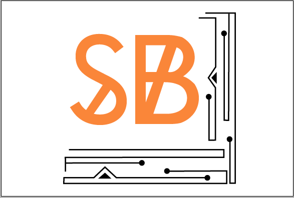
This year have been able to finalise my design interests, and the areas in which I feel my work excels. This areas are Branding, Promotion and Typography.
It is important to me for my logo and self branding to reflect my areas of interest, giving clients an idea of the wort of work I would be producing for them. I am also keen to exhibit my interest in typography, hoping to use a typeface I have produced for my logo.
I started to consider layouts of different typefaces and how this could inform my logo.I tried first to use a typeface I designed called Mass, only showing the heavier parts of a serif font.
I found that I liked the orange set against black and wanted to try this on some other levels, this time trying some other typefaces -
American Typewriter:
Chronic:
Bebas Neue:
Hipstelvetica:
The one I felt fitted most of what I wanted my logo to look like was Chronic, although I found that the S almost looked like a different weight to the B and this bothered me. I outlined the shape of the S, and tried out some other ways of including a block line across the letter. I found a typeface called Baron Neue which in my opinion was more fitting to the B, which I preferred to the original S.
After doing this I decided to do the same with the B, to see if I could get it closer to what I wanted, and also to keep the letters consistent with each other.
I fund myself struggling to settle on one thing that I liked enough to be my identity. I tried to use a different typeface I had designed, which I have yet to name but even just the S wasn't what I wanted.
I found that I was keen on the 'pinball' part of the design, so I made a border to go around my initials:
I went back and tried some of the other typefaces with this border in the hope that this would work better:
I found that when I went back to using Chronic this time around, I didn't notice the earlier problem I had with the S appearing lighter than the B, as this time it was set against a more distracting feature.
To me, this perfectly fitted my design interests and also my design process, which is very linear (with a few hiccups along the way).