Tuesday, 21 May 2013

It's Up To You - Packaging

I found that after finishing most of the aspects of my promo pack that it wasn't as innovative or out of the box as I would have liked it to be, so I decided to embody this in the packaging.


This whole concept is very personal but the mailer style packaging is clean and white which sort of takes away from the very personable content.


This packaging feels sort of natural and organic in the materials used. Combined with the colour scheme it gives it quite an earthy exterior.


The concept of this self promotion pack is kept extremely consistent and gives off a top secret impression, until it is opened where it looks lore like a gift basket.


This idea of packaging could become very recognisable for this person, and it prompts the viewer to make the product given to them (with supplies to make it). This ensures that it engages the viewer entirely.


This one is a little more simple but still equally as effective. The tissue paper in accordance with the colour scheme appears very elegant, similarly as with the consistency of the logo stickers.


This designer avoids any chance of the viewer forgetting who he is, embellishing 'Gary Corr' all over the products inside. The printed tissue paper is a nice touch and luckily the sweet provided works perfectly with the colour scheme.


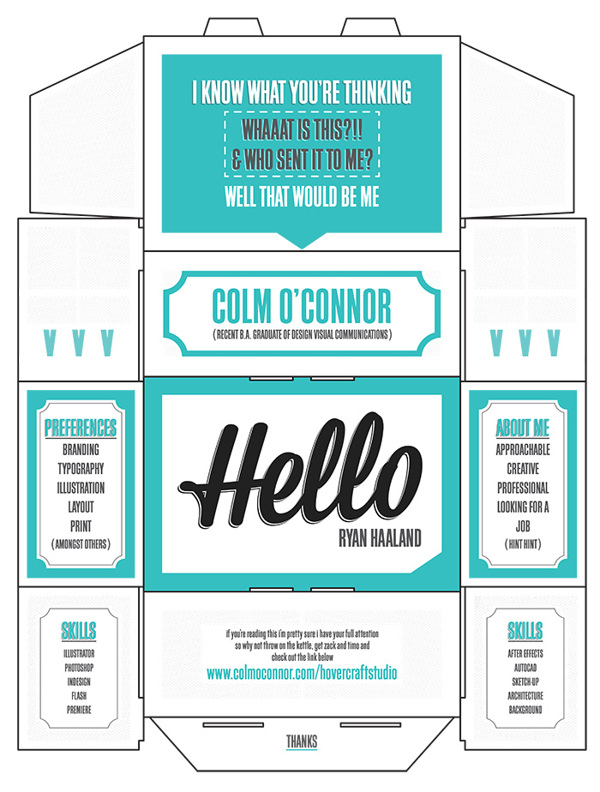


I love this concept of treating the packaging like postage. It builds a slight suspense and curiosity when opening it because it just seems like a package, but a package the employer can't remember ordering.

I decided to do something similar to this postage packaging concept but wanted it to be slightly more personable. After some research I landed on the idea of using a mailing tube but incorporating my own design on the exterior to keep it consistent with the rest of my promo pack.


I tried a couple of the ideas I had generated, each with quite a different approach but both consistent with the rest of the promo pack.

The first was based on a doodle like drawing I had done which I had then scanned in to work from. When it was scanned in I found it was of a poorer quality so I outlined it on illustrator.
Some parts of the image:


While I liked this design, I felt I wanted to keep it more like the other parts of the pack, including the symbols I had designed with a simple label of 'Sarah Butler/ Graphic Designer', and found that this one worked much better in partnership with the other parts of the promo pack.


This design will be mounted around the tube.

The last element of my promo pack is a little more difficult to explain in terms of design process.
The idea for my poster (which I hadn't planned on including) came because I started to doodle with my logo on a spare bit of printer paper and found that some elements of the doodle worked really well, so I redesigned some parts of it on a larger scale.


I added just a little colour, similar to those used in the promo pack which gave it a place with them. It varied hugely from the other parts in terms of style, but instead of looking out of place, seemed more to exhibit versatility.


Thursday, 16 May 2013

It's Up To You - Business cards and CV

To design my business cards I wanted to refer back to my front cover of my design process poster/booklet, and use the same angular design, but perhaps altering the colour.


I kept the logo consistent with the rest of my promo pack, and kept it simple in order to lend itself to the design. After experimenting with a variety of colour schemes, I decided to keep it low key, in white and charcoal grey.


I felt that the colour scheme should definitely be kept consistent on the business card so when I incorporated the triangular design, I altered the colours, making them each a subtly varied shades of grey. By using a dark grey as the basis for the card it appears a lot less harsh than if I were to make it black and white, and neutralises the design effectively.


I added just my contact details on the card to keep it simple, and gave those a white backdrop in order to make sure the type was legible, as I planned on that too being a shade of grey used in the design.


I used Geo Sans Light, which is totally stripped down but when centred and kept at a subtle colour it still demands most of the attention from the viewer.


I added a white border to outline the box as the grey edge was seemingly getting a bit lost in the design of the backgrop. This really directs the viewer to where their focus should be, which is on the details in the middle.

I wanted a similar theme to transfer to my CV, but with the incorporation of some of the symbols I had used before in my Design Process poster.
I planned to incorporate infographic representations of my skills, knowledge and interests. I initially brainstormed a variety of infographic responses before selecting a few that would accomodate the level I am trying to communicate for each category.


I decided to use a variety of the info graphic responses I had in mind to represent different aspects of my CV and did some experiments with that would work best for which area and why.


I really wanted to use a timeline to represent my education and experience as a sort of alternative perception of it, and by using this heart rate style timeline I was able to make each high point representative of a milestone education or experience wise, with the height of each peak depending and translating to the importance or impact the experience had on me career wise.


I decided to incorporate the same basic angular border for just the top of my CV as the one used for the business cards. But I altered the colour to varied shades of green to respond better to the colour scheme I was using for the inforgraphics. This boarder at the top of the page would be partnered with my logo, also changed to green and I made the whole page quite central.


After  designing this I realised that when printed, the border might seem more sparse and would be cut off at the top so I moved it down and minimised and centralised the other content. I continued to use GeoSans Light as I found it so light that having it scattered around the page created a balance rather than overwhelming it with both the infographic and the text.


I printed my CV onto thick white paper but found that it formalised some elements of it and changed the tone entirely. I made some quick decisions about stock, and landed on using brown sugar paper, half because I think it partnered well with the informal tone, and also because it seemed to create a medium between the cardboard tube and the other white paper, linking the two to each other more.