Thursday, 24 April 2014

OUGD502 A Design Presence - CV

I decided to change the format of my CV, making it more of a leaflet, that I could package in a sleeve that would feature my visual identity in order to ensure everything tied together.
I decided to feature a timeline on the reverse side which would document work experience, exam results and jobs chronologically. I planned to make the other side a bit more personal, perhaps with a personal mission statement and personal/contact details.


The typeface I have chosen to accompany my visual identity is Bebas Neue Light, as in my opinion, a simple but not submissive structure is needed to accompany the design. I feel that this typeface draws attention to itself but it doesn't demand all the attention of a viewer.


I used the same infographic symbols in my CV that I had used before as they allow me to say things about myself without clogging up the page with too much text. It allowed me to give the timeline part of the CV more structure and guidelines to follow:
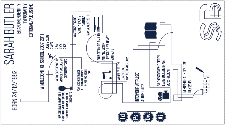

I found I was easily able to slot the symbols into the structure of the timeline, which made them more incorporated with the design.

In order to make this slightly more personal, I chose to include some photographs I have taken over the past year with a very low opacity, so they could be seen as a background. I tried to chose a variety and used photos that I had loved so as to give the reader a better idea of me.


Saturday, 29 March 2014

OUGD502 Life's a Pitch

As my responsibility with our business was to research into target audience and our company's aims, I felt it was important at this stage to come up with some sort of design manifesto.

I constructed a list of attributes that I felt were vital to our company in terms of our target audience and how we would ensure to be our clients first choice:

1. We strive to ensure that every relationship with our clients is nurtured to encourage it's longevity.
2. We take advantage of the range of disciplines we have as a group.
3. We constantly want to be thinking outside of the box and to make sure all of our ideas are new and current.
4. We are constantly hands on with our projects and never want a client to feel like they're left in the dark.
5. We try to remain easily accessible to our clients and provide flexibility in timetabling and scheduling.
6. We want to carry on learning and experimenting.
7. We wish to take ordinary things and allow our clients and audience to see them in an extraordinary light.
8. We will never settle for anything we don't consider to be excellence.

On top of this, I decided to mock up a mission statement to formalise the statements we had made above. The mission statements talks about us as a company and how and why we want to achieve all the elements of our manifesto. We have chosen a few key elements that we wish to capitalise on while working for Seam, and have explained their relevance and importance.


Thursday, 27 March 2014

OUGD502 A Design Presence - Promo

In order to maintain both variation and consistency in my promotional materials, I made some more varied linear designs to be used as borders, background visuals, emblems on stationary etc.

I tried to vary these subtly to make them an obvious part of the same pack. I started with the letterhead, for which I wanted to forgo the SB logo as I felt a linear design with a low opacity would create a more varied overall appearance. I used a few of the designs I had initially created and combined them into one larger one to take up the whole page in some different styles:


I ended up choosing the one I thought to be the most simple. With the address and details centred I felt it compensated for the lack of symmetry in the rest of the design.


Wednesday, 26 March 2014

OUGD502 - Life's A Pitch - Seam Meeting

We felt it was important for our group to meet and discuss each of our roles before we went on Easter break as then we would not be seeing each other for a few weeks. We wanted to ensure that we had all the appropriate research and presentation materials for the week back.

We made some slight changes to the initial roles and gave everyone something to be getting on with over the Easter Break:

  • Amy - Promotional material and living in London
  • Mel - Branding
  • Beth - Business
  • Danielle - Costs and Financing
  • Sarah - Target audience, Manifesto and future aims
In the meeting it was also concluded that Danielle would take up position of director, while the remaining four members would become shareholders, each with a 25% share of the company.

Saturday, 22 March 2014

OUGD502 Studio Brief 3 - Life's A Pitch

Brief
Working in groups of four you will construct a business plan or business proposal for a creative design studio and present it to your peers and tutors in an formatively assessed, oral presentation.
Your plan/proposal and presentation should be based on the analysis and content that you have been introduced to throughout the module.
Background / Considerations
Four heads are better than one as long as they communicate. You will now have the luxury of four pairs of hands. How will you use them effectively? You will need to consider the following:
  • What skills and services do you have to offer?
  • Who is your target market?
  • Who is your competition and how will you compete?
  • What are your costs, charges and financial considerations?
  • How will you structure your studio?
  • Who will be responsible for what?
  • How will you promote your services? To who? Using what media?

The group that I will be working with for this brief is:
  • Beth Dalzell
  • Danielle Muntyan
  • Amy Hill
  • Melissa Hardcastle
After brainstorming some initial ideas for a concept and business proposal, it was decided that we would make our business a design studio that focuses more specifically on fashion branding. Before going further we were each assigned a research topic chosen between us that would give us a better insight into the plausibility and reality of creating such a business.

I chose to look into our target market, and the sort of clients we would expect to be working with.


After looking at some examples and websites of some popular branding agencies that specialise in the fashion design field, I concluded that a strong working relationship directly with the client produces the most effective results. In light of this, it became apparent that, at least as a starting business, it may be more effective to work with smaller fashion brands, before climbing towards working with bigger and more international brands.
Working with less high profile designers and brands ensures that we would be able to get far more face time with the clients than if it were a bigger business. Most clients will be very specific about how their brand is received, especially in the fashion retail market, where the name means as much as whether or not the clothes look good. By working closely with them and developing a strong bond and relationship, we can develop an understanding of what our clients want, enabling us to utilise that skill more and more as we progress up the fashion retail ladder.


Thursday, 20 March 2014

OUGD502 Ether Development

A friend asked earlier in the year if I could help him construct the typeface to be used in the title sequence and end credits of the film he made for his dissertation, called 'Into The Ether'.
This was difficult having not seen the film yet as it hasn't had it's official release, but I was informed that it was quite dark and violent.

I have shown some of the initial mock ups and examples I created, but cannot go into more detail due to the film having not be released yet:


Tuesday, 18 March 2014

OUGD502 A Design Presence - Visual Identity

I had previously been developing a typeface that I felt reflected my opinion and view on design. It has a mechanical structure and involves a lot of shapes slotting in to place to create the letters.

I chose to develop this more for a visual identity as I think it exhibits a versatility that I would like to promote. I used Helvetica bold as a base, as I found the weight and the width of the letterforms allowed me to do more with them:


I had added more detail into these forms than the first version as I felt, given that only initials would be used in this typeface I had the allowance to make them more detailed without being overwhelming.

I decided to make this aesthetic the theme of my visual identity and so mocked up some patterns in this style to be used throughout my Promo Pack:


Given the very systematic nature of the design, I felt it best to keep the colour scheme a monochrome constant, as again, I didn't want much to distract from the impact of the visuals. I felt that colour combined with the design may overwhelm the viewer.

After referring to my previous research I decided I wanted to use either black stock with white visuals or vice versa, perhaps using a combination of the two.

BUSINESS CARD


I tried out some subtle variations in layout of the business card but found that the most simple ones were the ones that lent themselves best to the format when including the design: