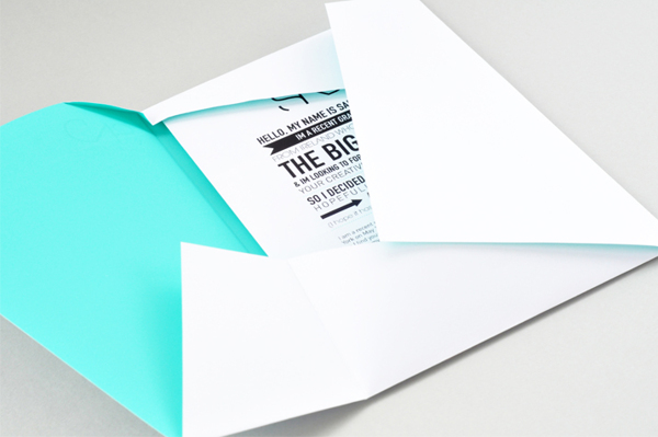
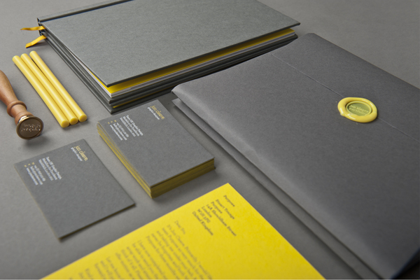
I chose a simple logo that could be altered slightly for each booklet.

However, after giving some thought to this concept I wasn't sure I wanted to make a comparison like this when I was supposedly promoting myself as a designer. If it were similar to a job application, this approach would be considered quite irrelevant and and employer probably wouldn't bother reading through them.
So I changed my theme again, keeping it really simple with only relevant and interesting information, to be designed in such a way that is interesting for the reader/viewer.
I explored a selection of logo ideas, trying to keep each of them simple and reflective of my approach to design, However some of my earlier ideas didn't end up being much of a reflection of me, they were too simple to achieve and I think they looked it.


For the design I ultimately landed on I chose to experiment and alter existing typefaces. I chose to alter the letters S and B in Desdemona and make it a bit more personal.

I placed a white 50pt box around the letters and adjusted the size to cut off some of the lines in the letterform. I used the pen tool to outline some parts of the type and to experiment with the parts that were covered up by the box.

When I had done this I landed on a design I liked much more than the others, I pasted the same form over the top to make it appear a little more complicated than it actually was. I decided that this one was simple and effective enough for me to use as my logo, it exhibited my style of design and where my design interests lie.

After landing on my logo design, I wanted a more thorough explanation of how I work, what I think about when working on a brief and how I deal with variables like time span. I decided to do a mind map showcasing my though process, and maybe somehow partner it with a design on the reverse.
To show as much variation in my work as possible I wanted to make the mind map fairly infographic, using symbols to represent different aspects of my process.

I kept these icons simple and obvious to the viewer so as not to have to explain any of them in too much depth.


I used these icons to represent answer to some questions I had posed in relation to design process, for example 'How will I manage the time?', 'What is my design objective?', 'What problems could I face?'.
There were some questions which required a yes/no answer so with those I provided solutions and next steps to each of those options

I made this in the style of a poster than would fold up in a booklet style with a from cover that can remain consistent with the rest of my promo pack, so I had to design a front cover.
I knew it would feature my logo design but I wanted to add a really simple border like design that could add a little colour to the whole thing, which so far was entirely black and white.
After a few thumbnails to determine this design I landed on one which featured overlapping and varied triangles, which slightly different shades of a colour, the colour I chose being green (my favorite colour to make it personal to me).
Before incorporating into the front cover I looked briefly at another way I could use this design, and placed it into some outlined shapes of SB.

However, I found that this was a bit far shot of the style I had been keeping and it seemed quite random when partnered with other aspects of the promo pack.

When the mind map and cover was completed I wanted to have something feature on the back, which showed my view on design as a whole. I had read a definition before which stated that design is 'intent with a sole purpose'. While I agree with this statement I believe that the definition of design should go far deeper than it, as the sentence just seemed to brush the surface of what design is.
I adapted this definition to apply to me and how I look at design, and landed on 'Design is a visual intention with a definite purpose'. It implies that design is just designed, there is an intention behind every design created, some of those intentions may be more superficial and commercial than others, but an intention none the less.
I chose to go back to the style I used for my logo, typing this sentence in Desdemona and placing the box around the edge which blanked out some characteristics of the letterform.
The finished spread pre-printing: